There are two distinct sections to the Lowe’s Realtor Benefits website: the pre-login (marketing) and the post-login (interface). When users first land on the site they are likely new to the program and need a little more information… after all committing to a sign-up form is a big step. The front page is simple in design but clear in its strategy…to communicate the key benefits of signing up. No smoke-and-mirrors, no mumbo-jumbo, just the facts.
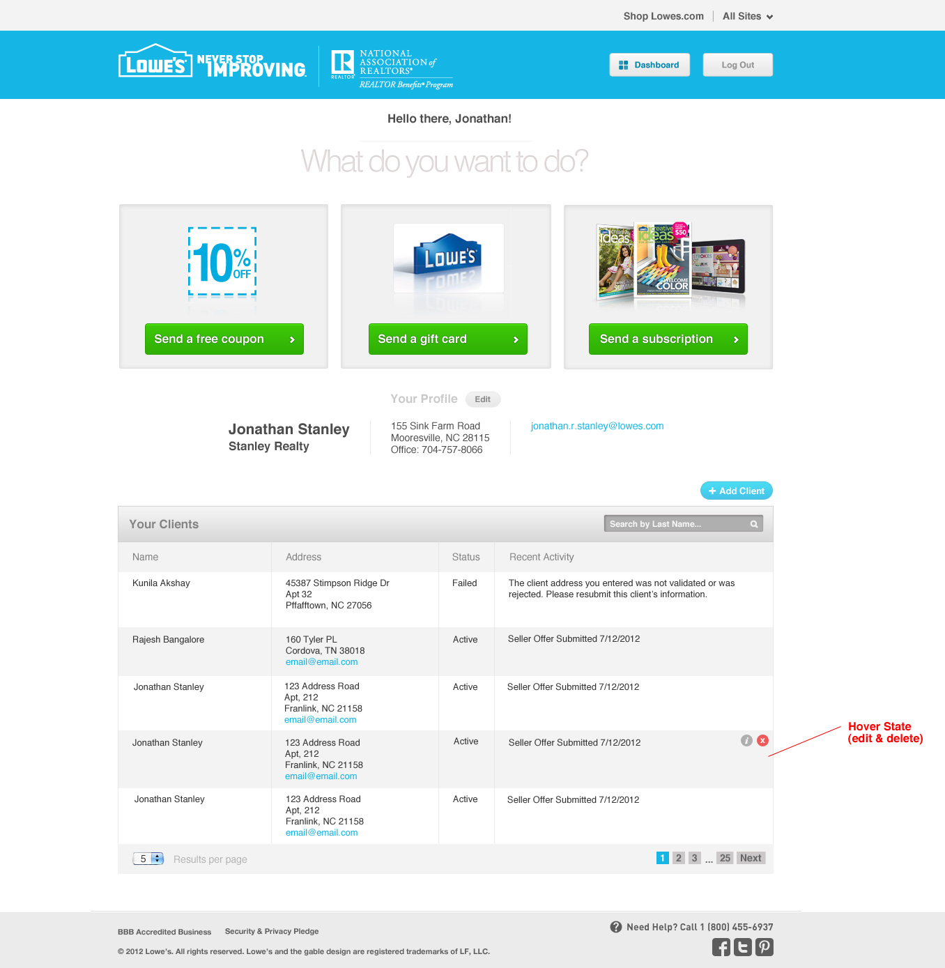
Once you are a member of the program, you will be directed to the dashboard interface which follows the same UX strategy and gives you access to the tools you want:
- Send A Coupon
- Send A Gift Card
- Send A Free Subscription
- Manage Your Client List
…and that’s it. The previous version of the site had an extraneous amount of tools and features that no one cared about and over-complicated things. Working with the user data and our wonderful business client we were able to surgically removed all the junk…and get to what people really wanted.
Pre-Login: The Marketing
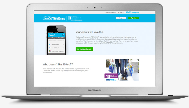
Here is what the main page looks like:
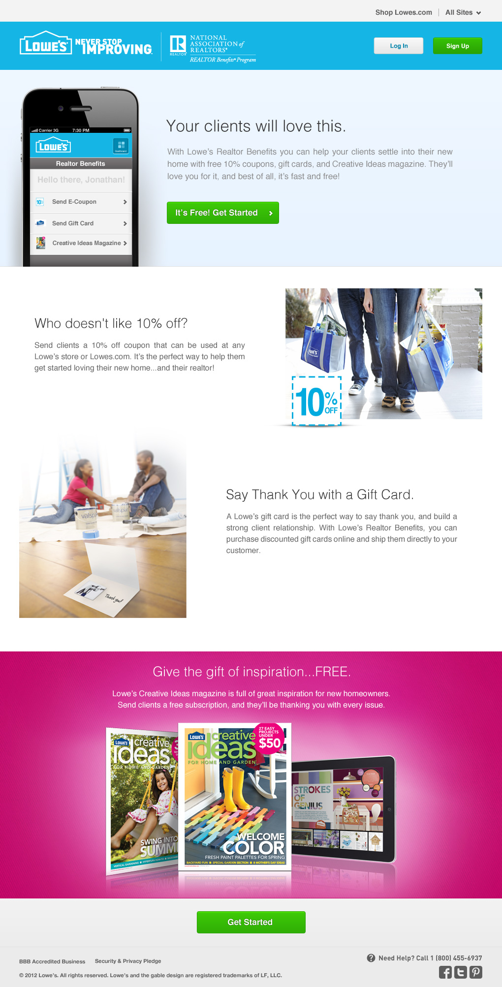
Photoshop Trickery
Nothing to write home about, but I did a bit of simple Photoshop work to make the photo work with the content:

Post-Login: The Dashboard
Here is the simplified toolset realtors are presented with once they login. Keepin’ it clean!